High-performance packaging design developed with angled top shoulder channels that prevent slipping during the dishwashing routine with wet and foamy hands, ergonomic body with a slim waist curve and transparent/opaque CMF architecture.
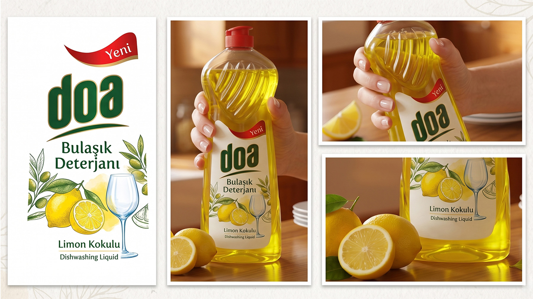

The process of washing dishes by hand is a daily routine that requires physical effort in the kitchen with foamy and slippery hands. Our main source of inspiration in the Doa Dishwashing Detergent packaging design project; The aim was to create a form language that is strong, practical and reassuring like a "superhero" that resists the difficult oils in the dishes.
Dynamic, curved and deep channeled texture in the upper shoulder area of the form; It both refers to the muscular and dynamic body structure of the superhero figure and serves a superior anti-slip function when gripped with wet and foamy hands. The ergonomic silhouette with a slim waist curve allows the user to grasp the bottle effortlessly and squeeze the ideal amount of detergent in one move.
“Doa Dishwashing Liquid packaging provides maximum grip with wet hands with its dynamic upper texture, while offering a practical and powerful solution against difficult oils in the kitchen with its form inspired by superhero energy.”

Deep embossed parallel grooves that prevent foamy hands from slipping over the bottle.
Narrow waist that fits the natural anatomy of the hand and requires minimal muscle force when squeezing.

Push-pull lid with precise dosing holes that can be opened and closed with one finger and does not drip.

Balanced base area on the sink counter that prevents it from tipping over on wet surfaces.


The Doa Dish family was designed with two contrasting material strategies to meet different consumer expectations on the shelf:
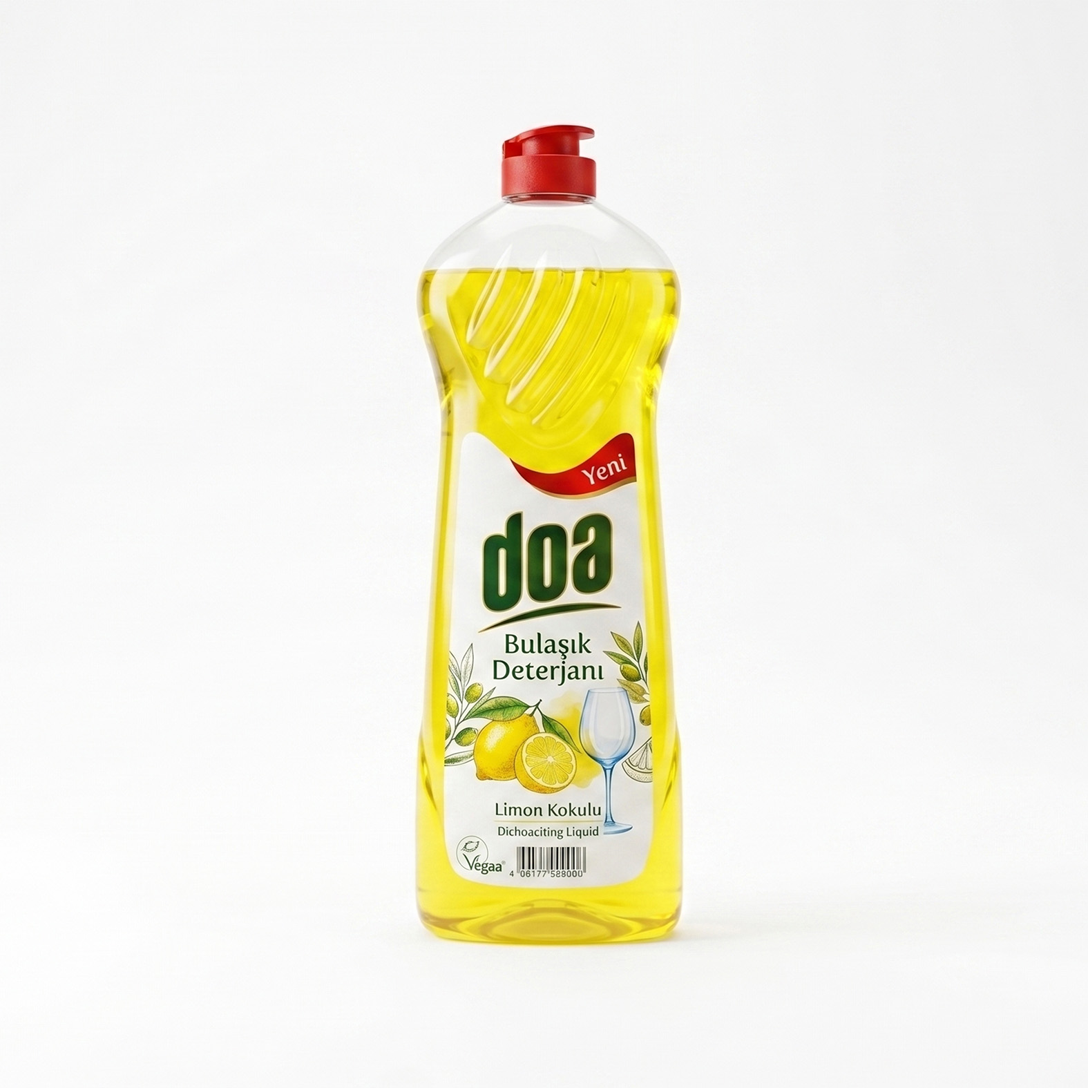
While the opaque body in metallic platinum gray tone symbolizes the heavy oil dissolving professional formula and industrial cleaning power; The transparent yellow PET body reveals the natural freshness of lemon essence and the sparkling viscosity of the detergent directly to the consumer's eyes. In both versions, the red contrast cover color complements the brand energy.

Transparent body showing sparkling liquid color and refreshing citrus freshness.

Strong metallic pigment representing the formula that instantly removes difficult dried oils.

Polymer memory that is easily dosed onto the sponge and returns to its previous form when released.

Space that provides perfect label adhesion and brand visibility from a long distance on the shelf.


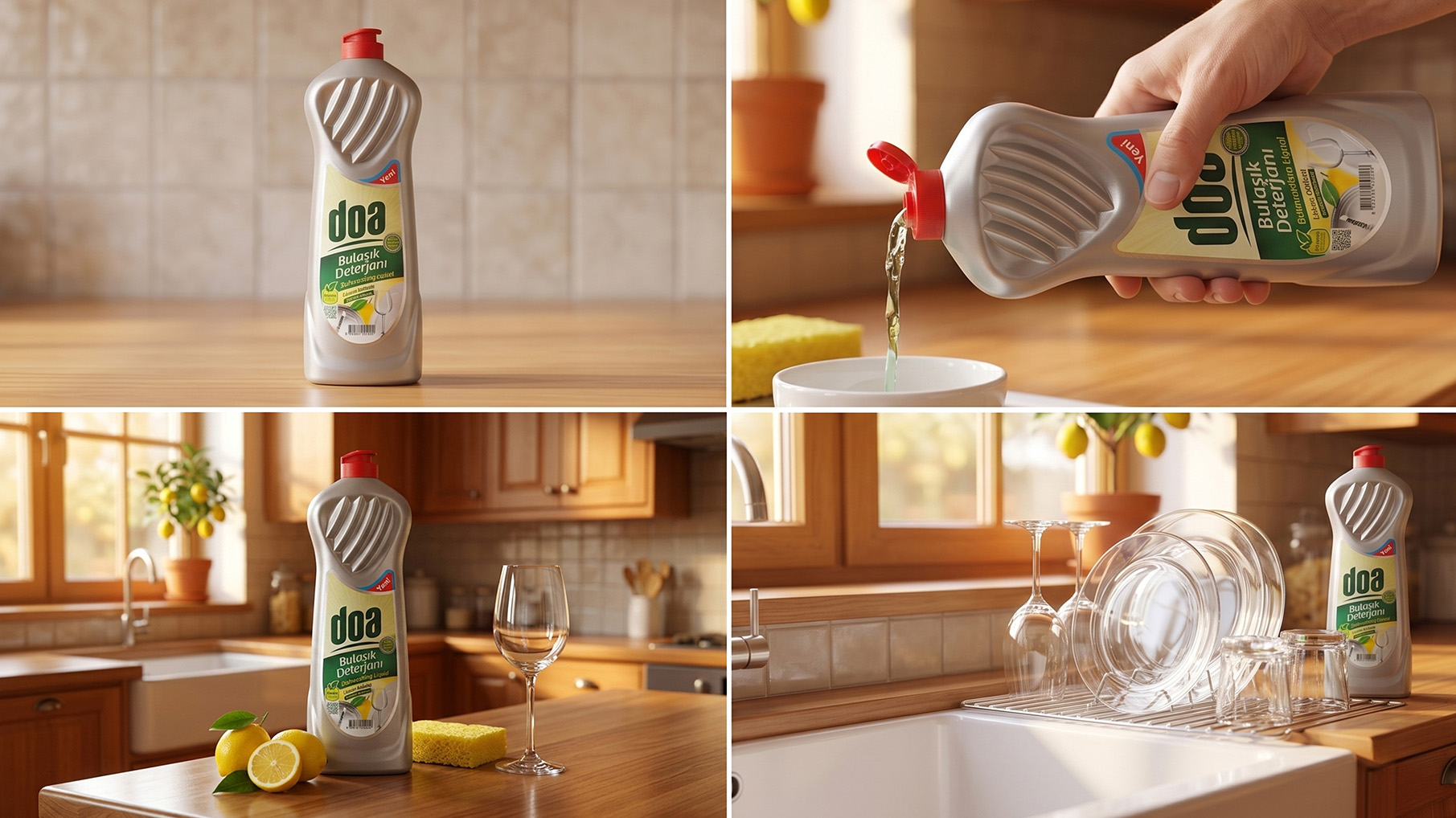
Deep angled rib channels prevent the bottle from slipping when washing dishes with wet and foamy hands.
Slim waist geometry allows the fingers to fully wrap around the body and allows precise dosing with one hand.
Transparent PET reflecting the freshness of lemon and metallic platinum opaque body representing professional degreasing power.
Rigid base that does not get stuck in FMCG filling conveyors and DFM wall thickness suitable for high volume molding cycles.
Hand slipping dynamics, detergent squeezing efforts and counter constraints during dishwashing.
Angled channels and slim waist curve sketches inspired by superhero breast form.
PET blow molding separation lines, wall thickness distribution analysis and push-pull cap throat tolerances.
Wet foam hand grip tests, flexible polymer memory and conveyor stability monitoring.
Start of mass production of multi-cavity blow molds, opaque platinum and transparent lemon yellow.